How to build a useful interior design moodboard
A strong moodboard does more than collect attractive rooms. It gives a residential concept a point of view, shows how decisions relate, and makes the next client conversation easier.
Start with a question, not a collection
Before searching for images, write the room’s job in one sentence. The sentence should describe an experience rather than a shopping list: a quiet bedroom for slow mornings, a sociable kitchen with durable warmth, or a compact living room that feels open without becoming bare.
Keep the brief visible while you gather. When a reference is tempting but does not answer the question, place it in a holding area rather than letting it steer the board.
Useful brief prompts
- Atmosphere
- What should the room feel like when someone enters?
- Behavior
- What will people do here, and what should the layout support?
- Constraint
- Which existing element, measurement, budget, or maintenance need must guide the concept?
- Conversation
- What is the one decision you want a client to respond to first?
Choose references that carry information
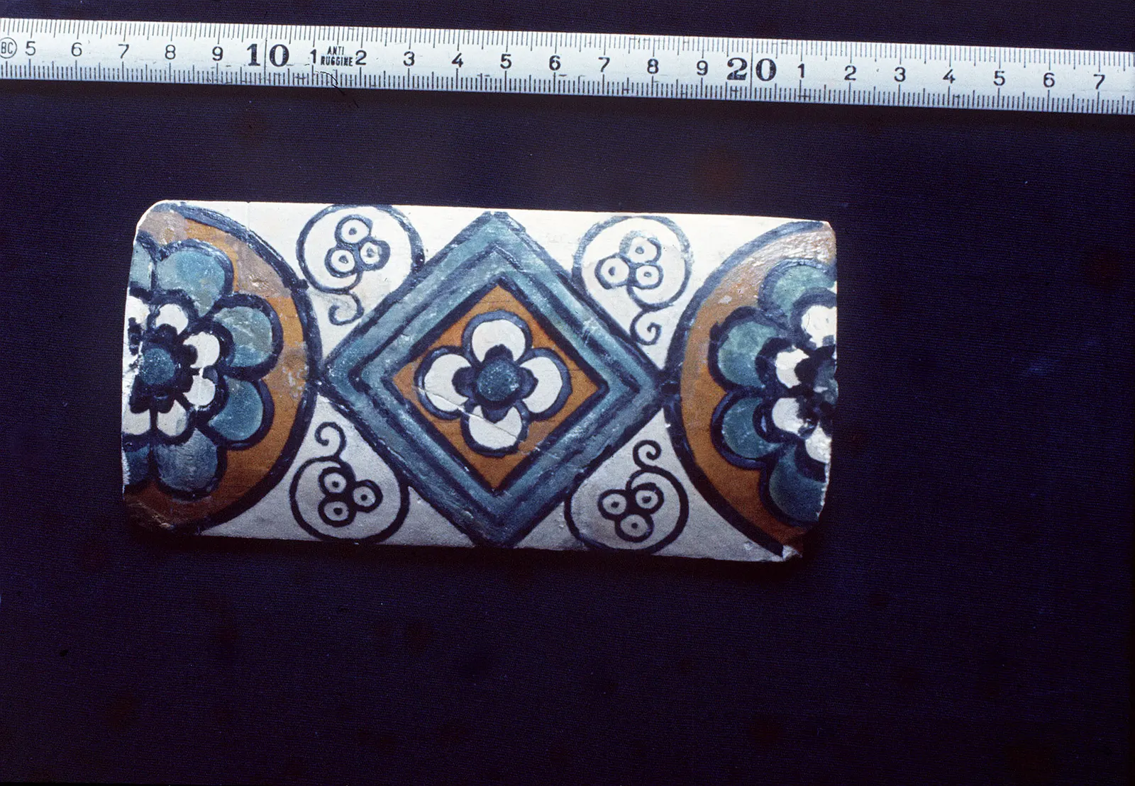
Use a mix of wide and close views. A room photograph can communicate proportion and light; a detail can communicate edge treatment, texture, or the way two finishes meet. The board becomes clearer when each image contributes something different.
A practical reference set
- One atmosphere image: establishes the emotional direction through light, proportion, or pace.
- Two spatial cues: show useful arrangements, sightlines, joinery, or furniture relationships.
- Two material details: clarify tactile qualities such as grain, weave, stone movement, or sheen.
- One contrast: tests what prevents the concept from becoming flat or overly predictable.
Record a short note beside each image: “keep for the light,” “keep for the scale,” or “keep for the quiet contrast.” If you cannot name the reason, the reference may be decoration rather than direction.
Build a palette with roles
A balanced board is not necessarily a neutral board. It is a board where color and material choices have identifiable jobs. Start with the element that should anchor the room, then add supporting tones and a controlled point of difference.

Palette roles
- Anchor: the largest or most visually grounding surface, such as flooring, cabinetry, or a dominant wall tone.
- Support: finishes that repeat or soften the anchor without competing with it.
- Texture: tactile variation that gives a restrained palette depth.
- Accent: a smaller, intentional shift in color, shape, or sheen that adds energy.
View swatches together and in the approximate proportions they will occupy. A small sample can look persuasive alone but become too strong when repeated across a large surface.
Make the board easy to read and easy to discuss
Editing is where a moodboard becomes a working tool. Remove near-duplicates, separate approved direction from open exploration, and arrange the board so the eye moves from atmosphere to specific decisions.
Final review sequence
- Name the concept: give the board a short working title that captures its point of view.
- Check the brief: confirm every major cluster supports the room’s use, feeling, and constraints.
- Trace repetition: look for colors, shapes, or textures that recur enough to create cohesion.
- Mark uncertainty: label choices that need a client decision instead of presenting them as settled.
- Prepare the conversation: choose three observations you can explain without making the client search the board for context.
A useful test: hide the image captions and describe the concept from the visual relationships alone. If the story disappears, the board needs fewer references or clearer grouping.